Spendcut grew into a company with more than one million euros in revenue. The website is where that growth starts — it turns visitors into members and members into switched contracts.
Project Overview01
Project Overview
About Spendcut
Spendcut is a Madrid-based private club that gives members access to discounted, commission-free subscriptions for car and home insurance, internet and electricity & gas. Members pay a small monthly fee only once they start saving, and the Spendcut team takes care of switching providers for them.
Problem
People overpay for bills because comparing offers and switching providers feels confusing and time-consuming, and many don't trust price comparison sites that earn hidden commissions. Spendcut needed a website that builds trust instantly, explains a new business model in seconds and makes signing up feel effortless.
My solution
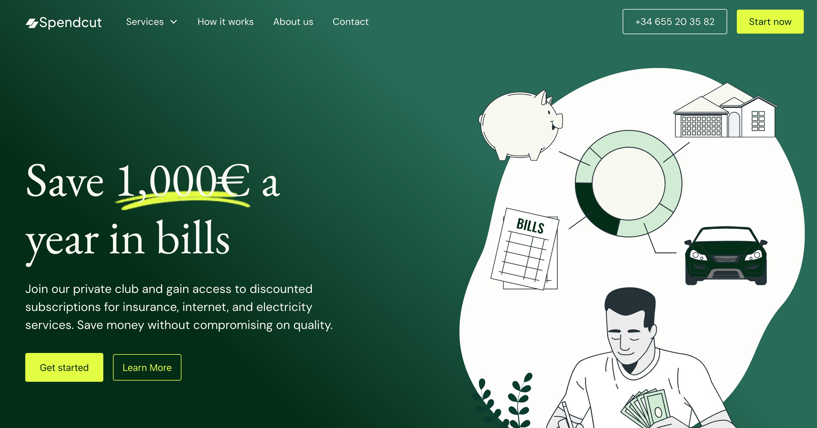
I designed a calm, trustworthy identity on the web: deep forest green for reliability, a fresh lime accent for savings and calls to action, and an elegant serif paired with a clean sans-serif. The page leads with one clear promise — save 1,000€ a year — shows real partner brands, presents every service as a simple card with its starting price and average discount, and walks visitors through the switch in four easy steps.
Structure02
Page Structure
The page follows the questions a visitor asks: how much can I save, can I trust you, how does it work — and what do other members say?
01Hero & promise
02Partner logos
03Service cards
04Pricing model
05All in one place
064-step process
07Call to action
08Testimonials
09FAQ
10Contact
Design System03
Design System
A small, consistent system kept dozens of pages — services, landing pages and onboarding flows — feeling like one product.
Every section answers one question and ends with a clear next step.
Hero with one promise
A large serif headline makes a single, concrete promise — "Save 1,000€ a year in bills" — with the number underlined like a hand-drawn highlight.
A friendly illustration of bills, a house, a car and savings shows every service at a glance.
spendcut.com
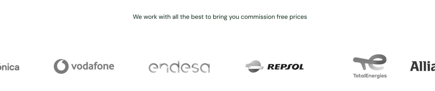
Trust from the first scroll
Right below the hero, a moving row of partner logos — Vodafone, Endesa, Repsol, TotalEnergies, Allianz — answers the biggest question: "is this legit?"
spendcut.com
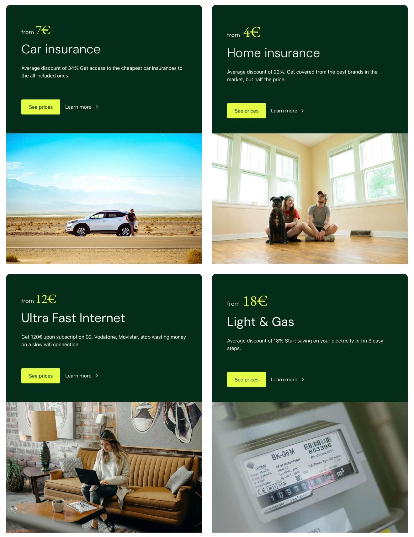
Service cards
Each service gets one card with its starting price, average discount and two actions: see prices or learn more.
Lifestyle photos under every card make insurance and energy feel human instead of technical.
spendcut.com
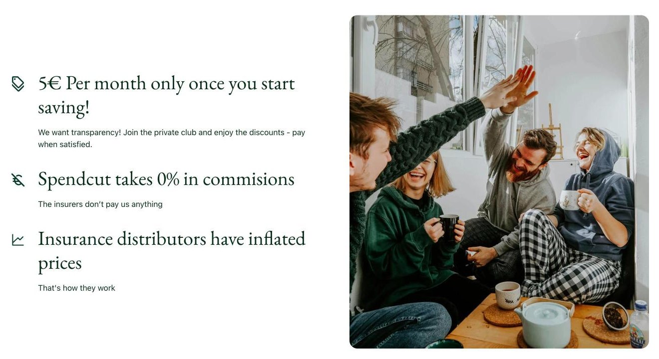
A transparent business model
The pricing section explains the model in three short lines: 5€ a month only once you start saving, 0% commissions, and why traditional distributors are more expensive.
spendcut.com
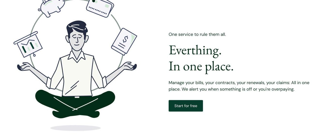
Everything in one place
An illustration of a calm, meditating member juggling bills shows the real benefit: no more stress about contracts, renewals and claims.
spendcut.com
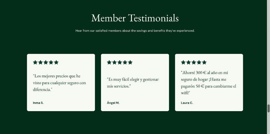
Member testimonials
Short quotes from real members in Spanish, with five-star ratings, close the page with social proof before the final call to action.
spendcut.com
Onboarding05
Onboarding Flow
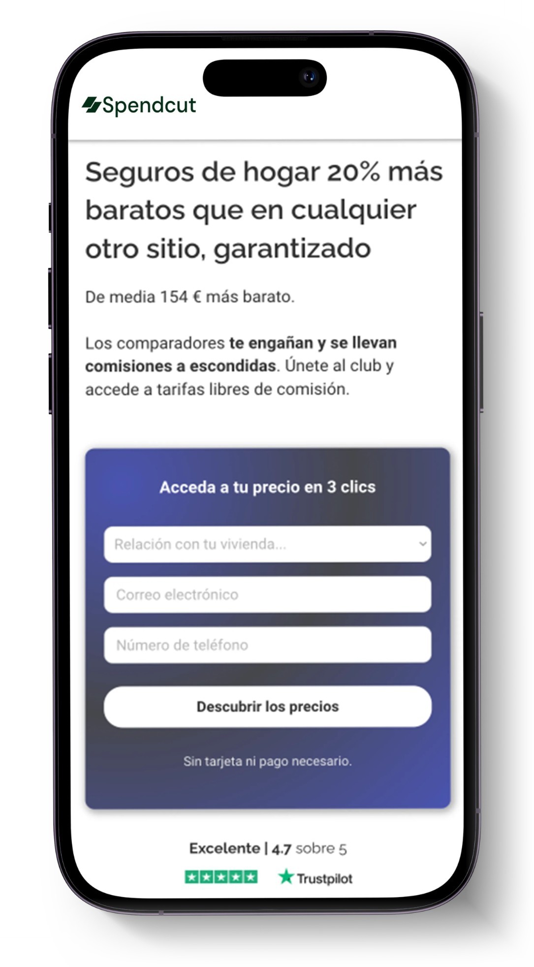
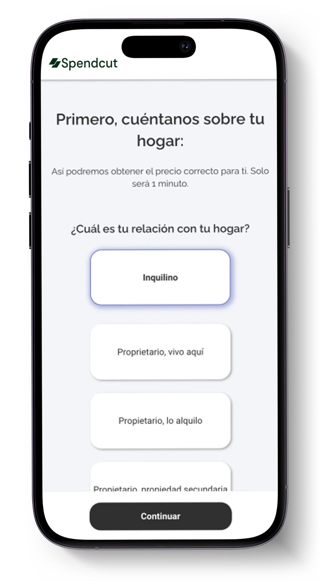
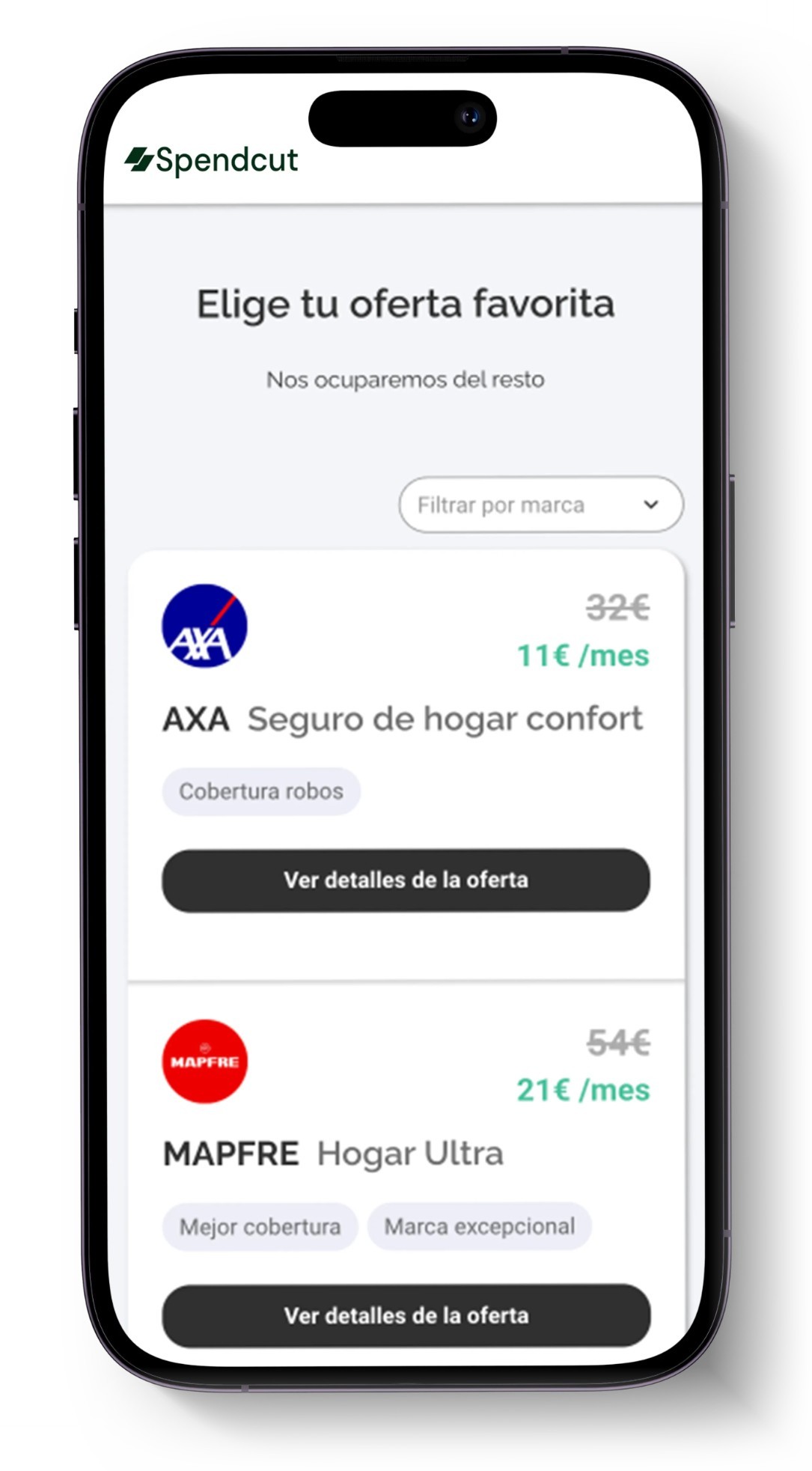
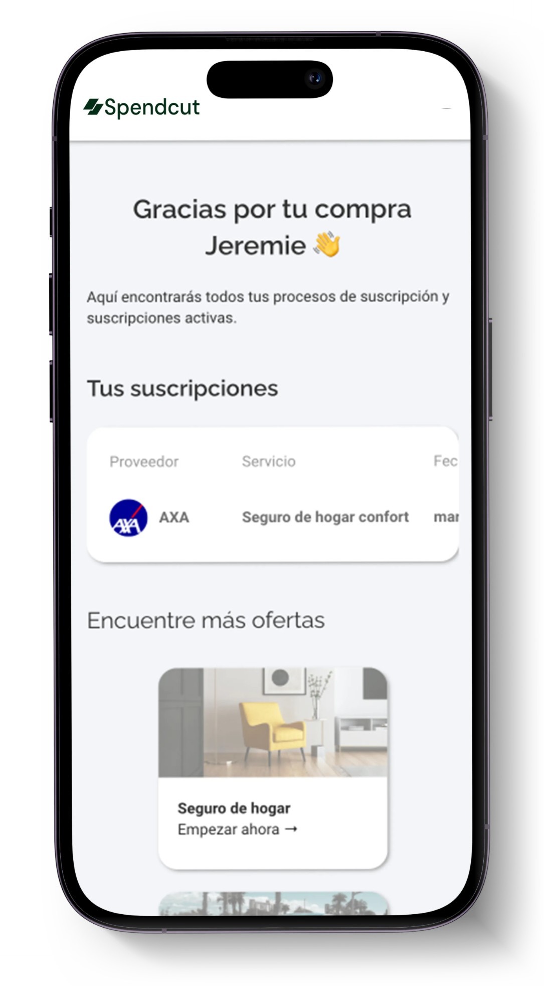
Switching providers is usually the scariest part, so I designed a fully online, mobile-first onboarding: see your discounted price, answer a few simple questions one screen at a time, pick a discounted offer and find every contract in your personal dashboard.
01 See your price in 3 clicks02 One question per screen03 Pick your favorite offer04 All contracts in one dashboard
Webflow06
Built in Webflow
Scalable pages
I built the website in Webflow with reusable components, so the team could launch dedicated landing pages for every service — car insurance, home insurance, internet and energy — and separate onboarding flows without starting from scratch.
Details that convert
Scroll-based background color changes, sticky product screens in the step-by-step section and a moving partner logo strip keep the long page engaging, while a sticky header keeps the phone number and the "Start now" button always in reach.
Result07
Result & Insights
€1M+Revenue reached by the company
4Services in one membership
0%Commission model, clearly explained
Spendcut showed me how much design can do for a business: a clear promise, visible trust and a simple path to sign up matter more than any decoration.
Today Spendcut has grown into a company with over one million euros in revenue — and the website remains the front door for every new member.