Gazgin is considered one of the leading booking platform in the tourism industry - allow customers to discover deep sides of city journey. The major target of developing Gazgin project is providing the easy (comfortable) user experience for their potential customers. Gazgin is not serving only for physical customers but also creating high-level B2B system for the directors and owner.
Problem
While making brainstorming over app, it appears that customers face issues while finding the most suitable house for rent. Also, owners provide the house ads through only in social media apps. So, we needed to build reliable and easy-usage platform for community. In the first stage, application owners required the minimalist and easy user-experience design from me.
My solution
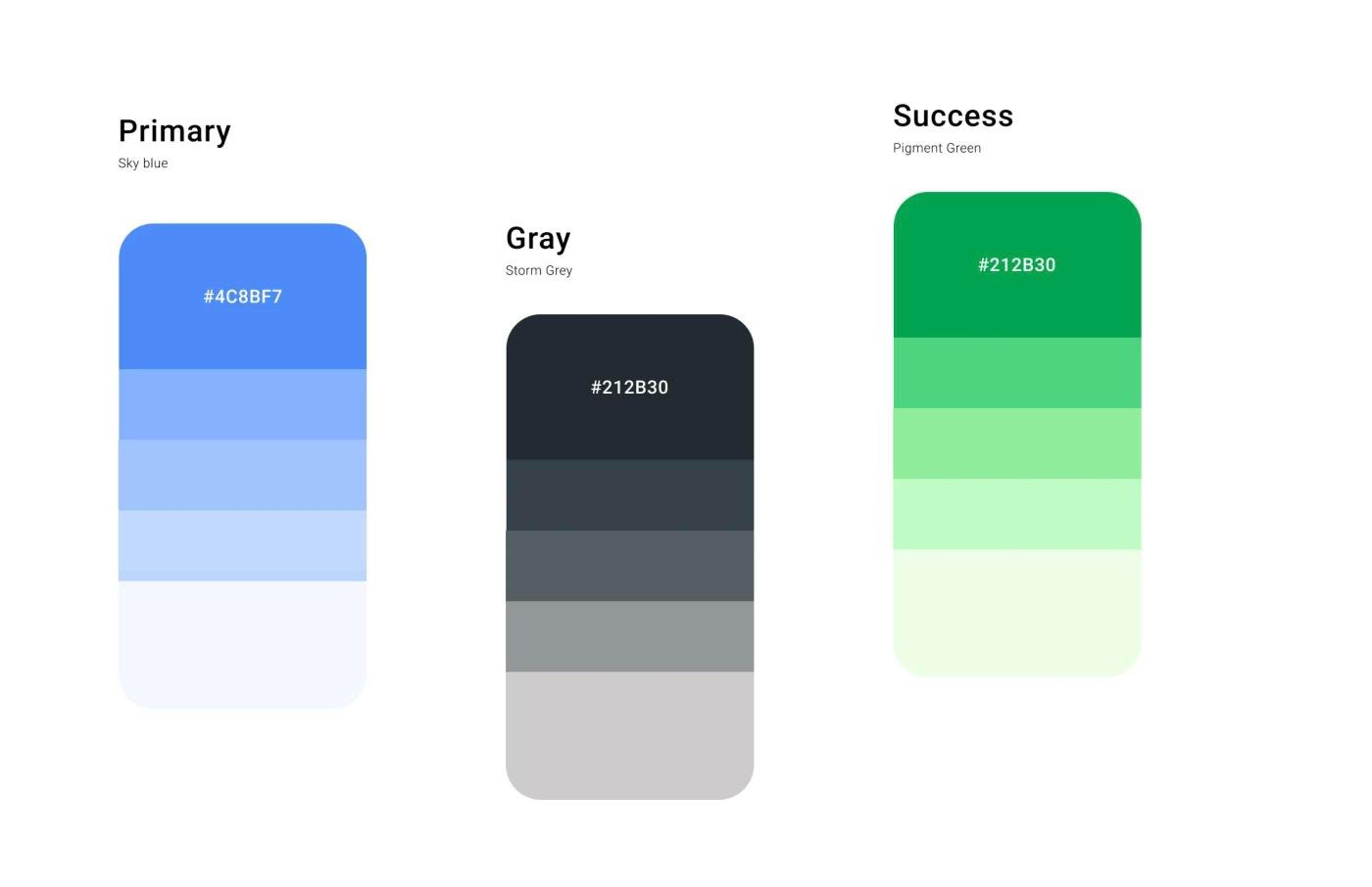
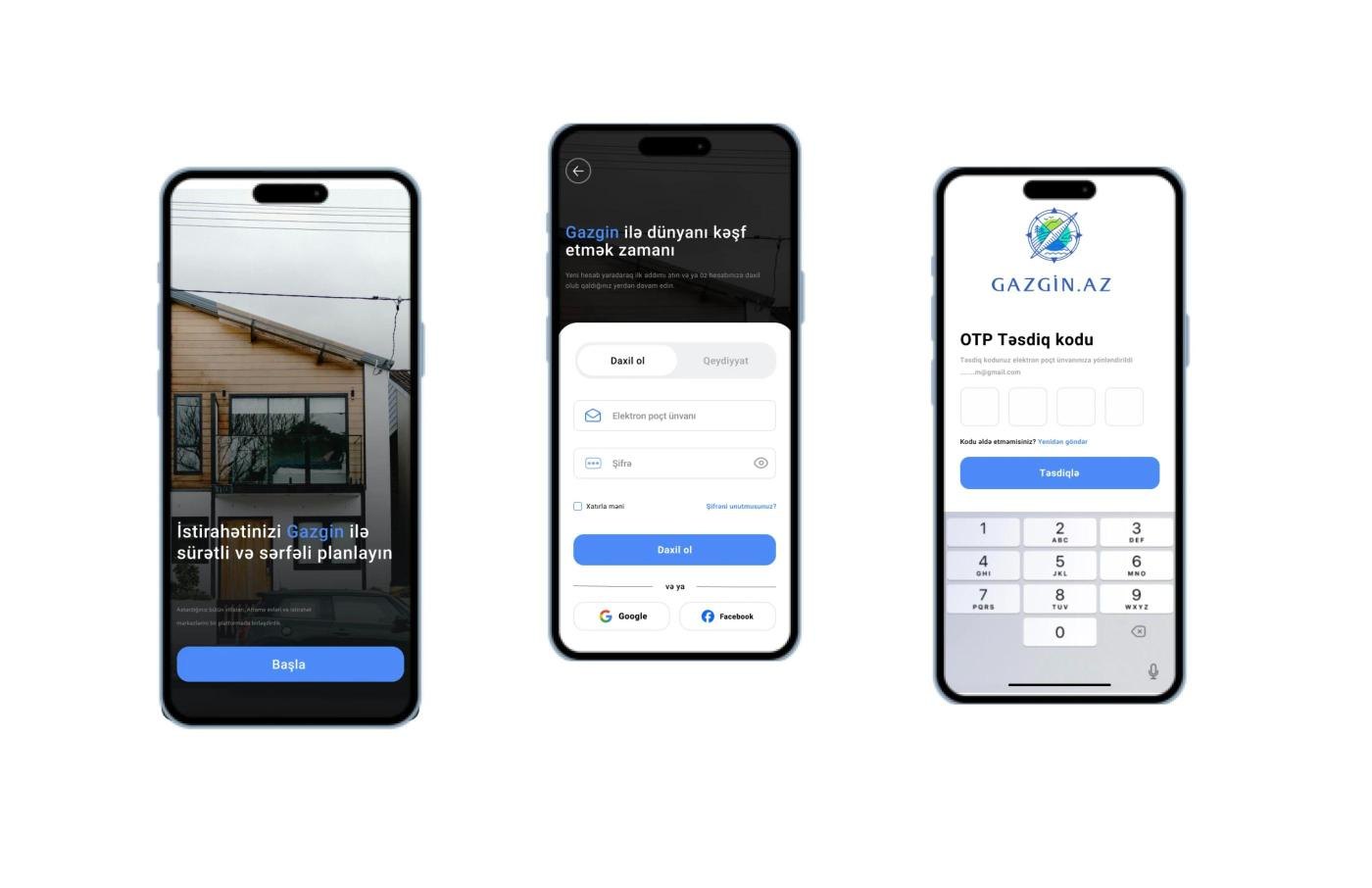
Before starting the design process, I identify most suitable color range for the application. After checking global booking platform, I decided to use blue color and its gradient over app. For minimalist design, I made the easy login/signup process. Through app, it only takes average 3 minutes in registration process. Overall, I applied the latest UX/UI trends on app. Also, advanced filter system will make customers renting process easier and faster.
User Flow02
User Flow
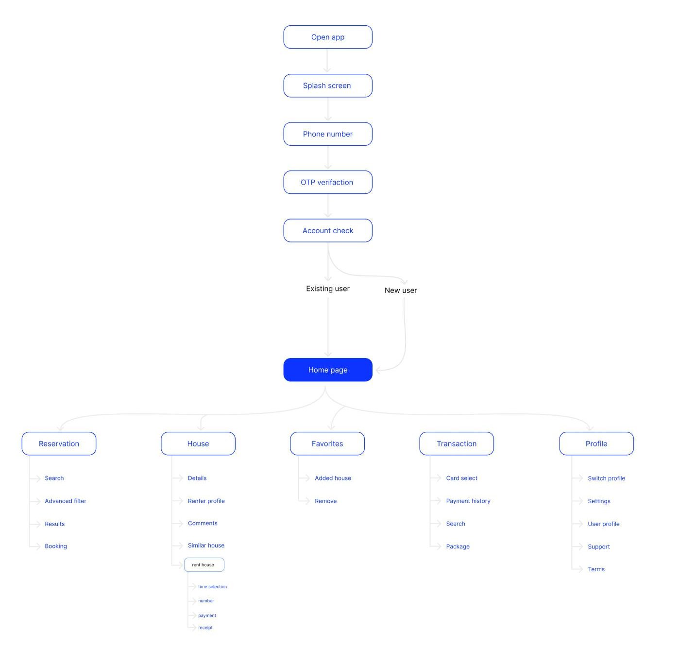
I created user flows to help me with a design process of "Gazgin", ensuring that tasks within the app are intuitive and easy for users to accomplish.
Wireframe03
Wireframe
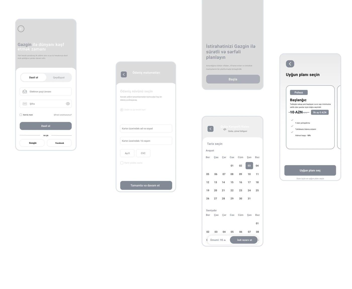
Creating wireframes lays out a clear blueprint for the user interface. This helps visualize layout and functionality early on.
Design System04
Design System
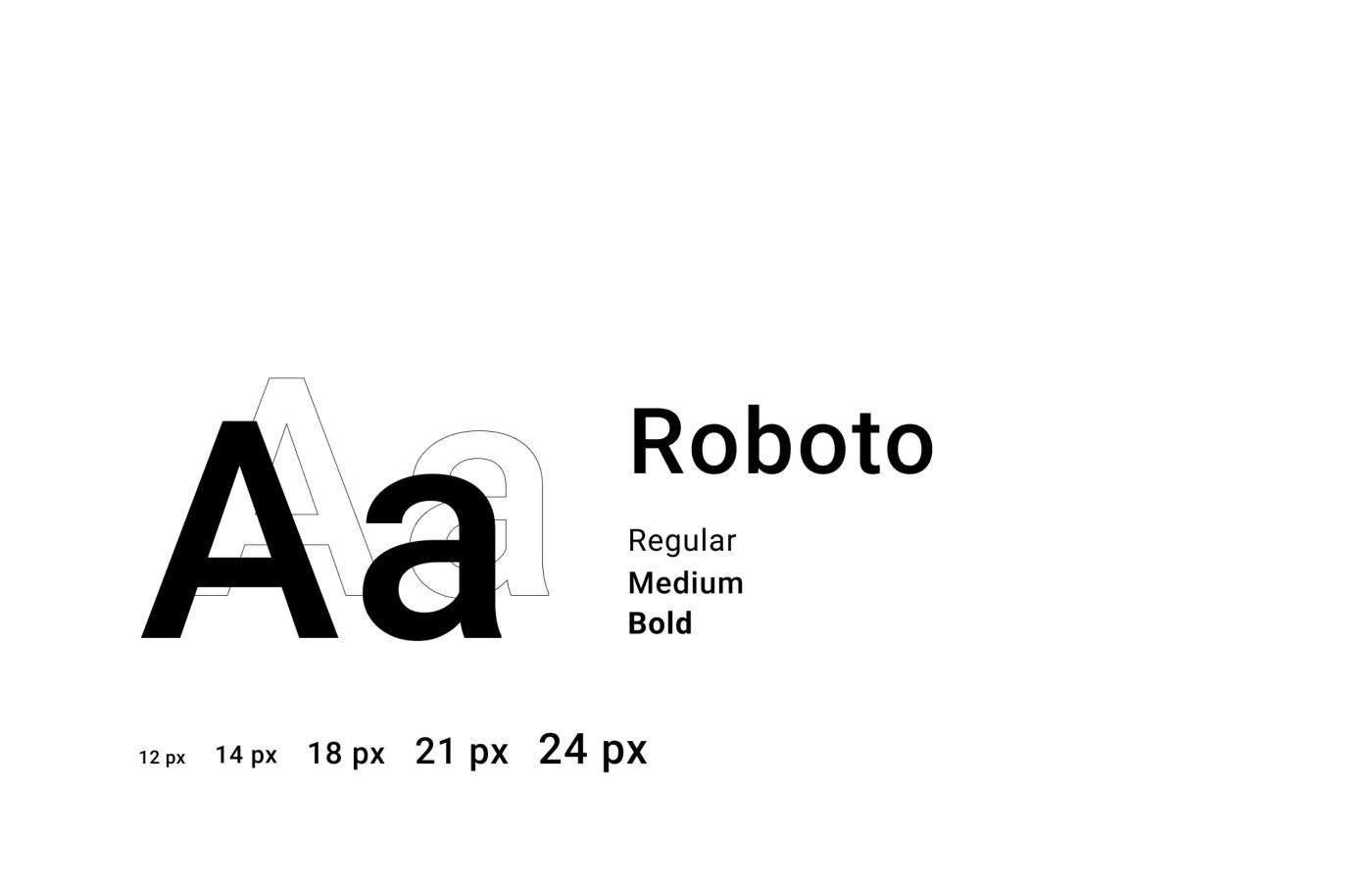
I developed a design system to ensure consistency and coherence throughout the app, providing users with a seamless and cohesive experience.
Typography
Typography
Colors
Colors
Icons
24 × 24 size
More
Logo
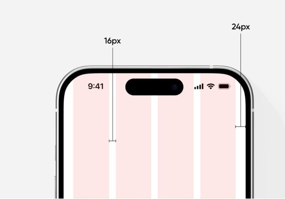
Grid system
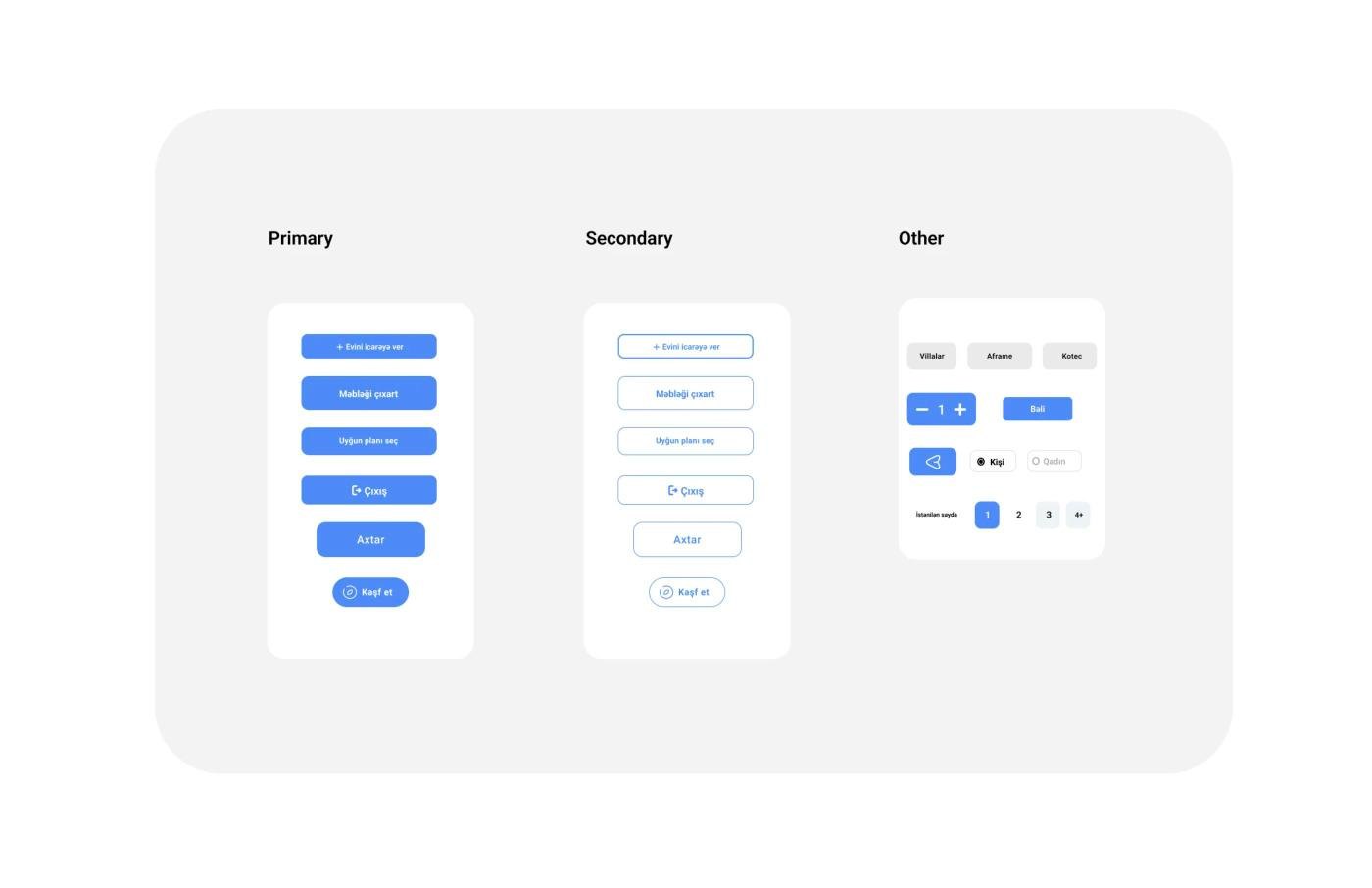
Buttons
UI Screens05
UI Screens
The design of login screen is intuitive and simple. I've streamlined each screen, avoiding non-essential elements. This ensures clarity in identifying required fields and eliminates any confusion in the process.
Home Page
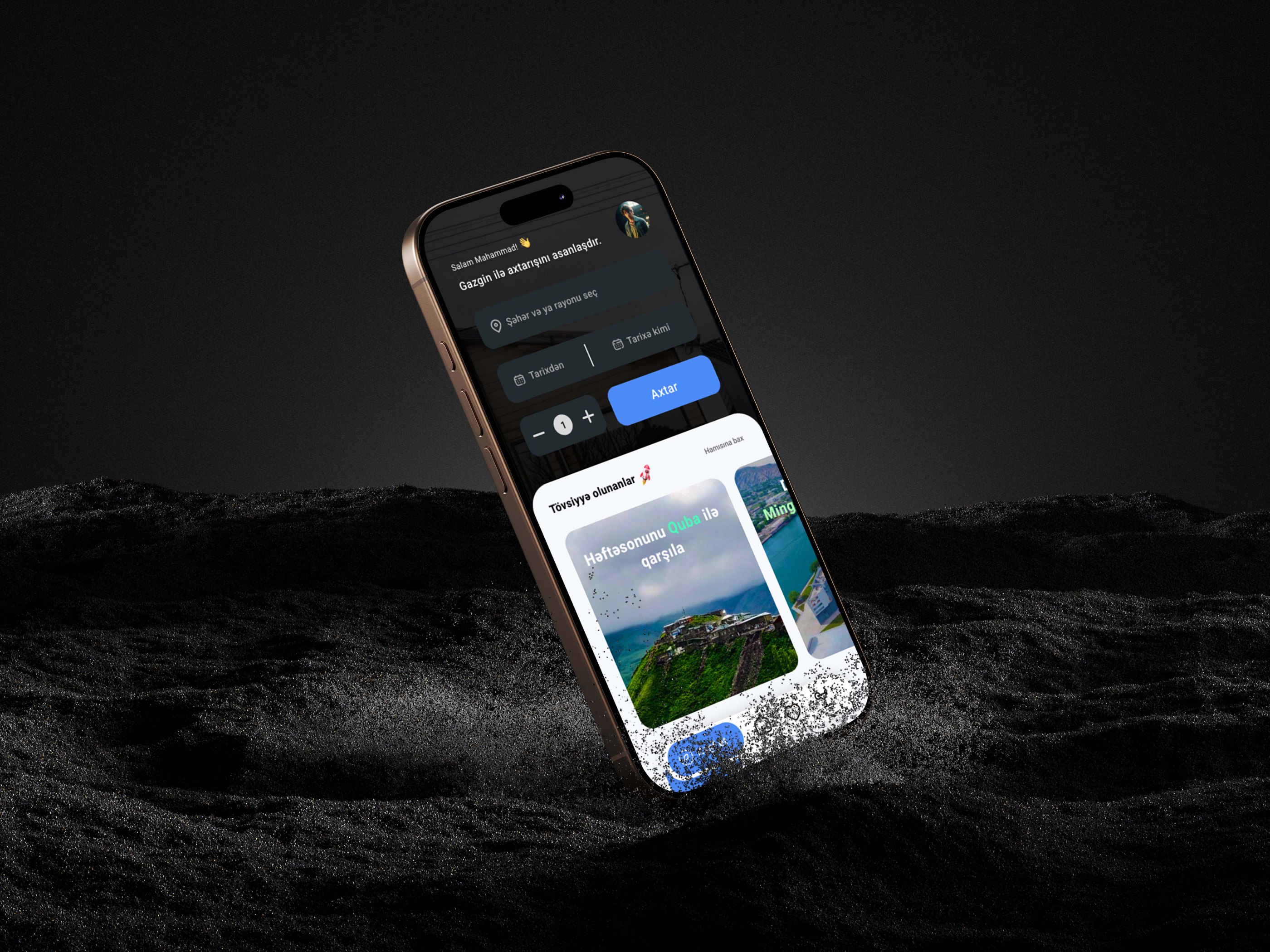
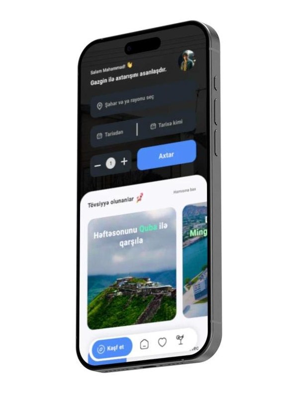
The home page displayed with bold and large text, allowing users to easily view rented houses. With the "search" button, customers find out the most suitable and comfortable house or villas.
Recommended part of page provide customers discover restaurants and various places. Colorful and distinct icons are included for each service, enabling users to easily navigate through places.
Transaction
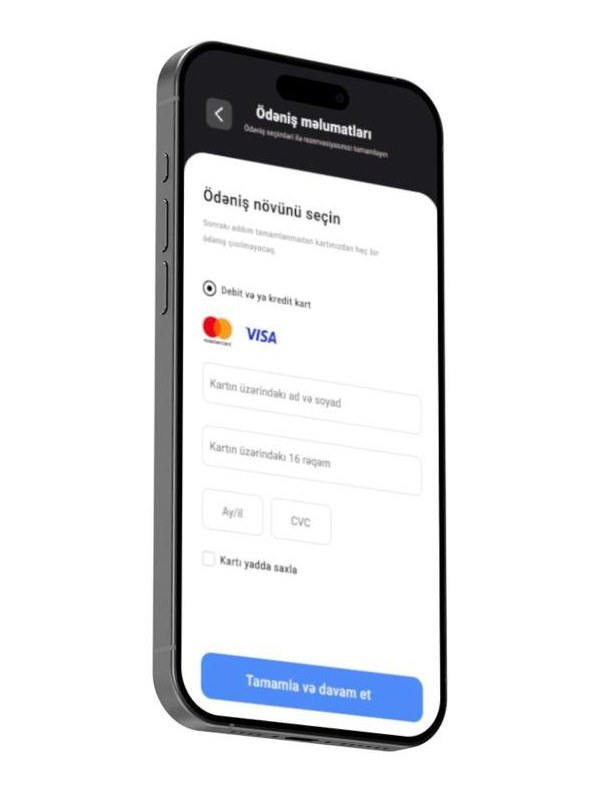
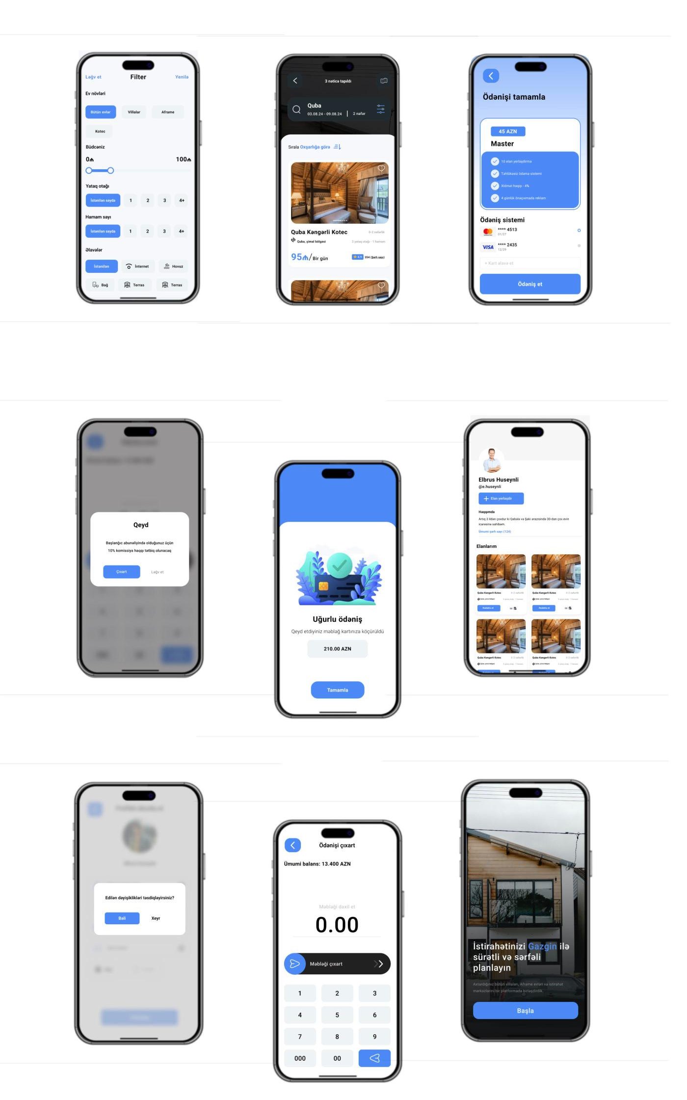
Transaction page help customers to select debit or credit card easily through adding required information for transaction process within minutes.
I added the save card information button in the transaction page. After completing payment process, successful transaction page appear in the screen.
Profile
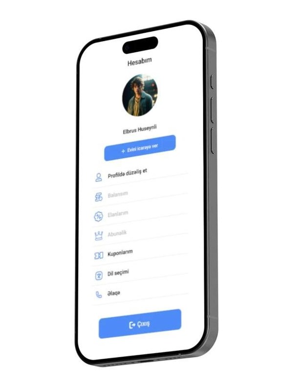
In the profile screen, users can view and edit their profil info, manage notification preferences, and choose between renter or customer profiles. Additionally, they can adjust app settings and easily contact support team.
The logout button stands out with its blue color and is separated from other buttons to prevent accidental logouts.
Subscription plan
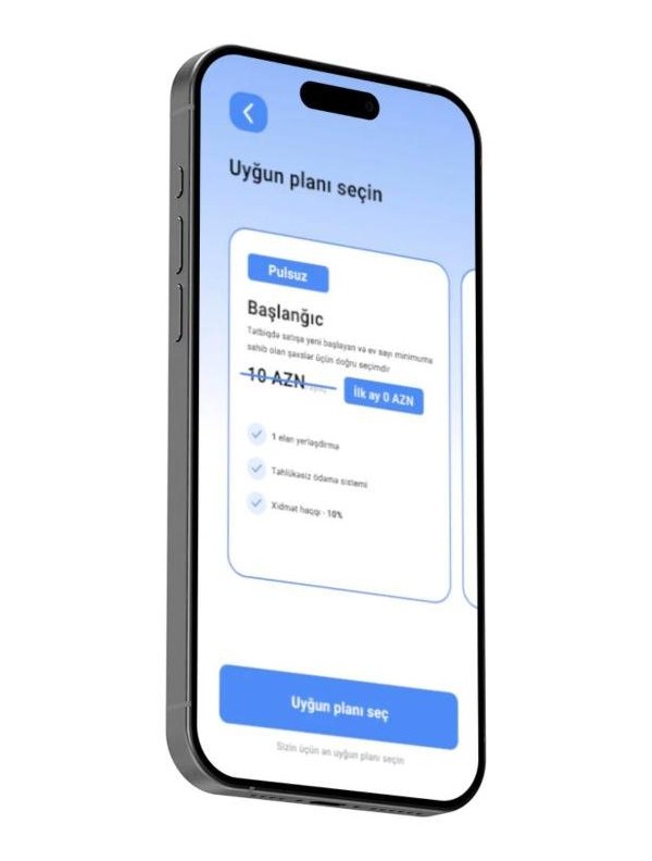
In the subscription page, customer find out two major packages which consist of free and premium plan. The free plan has limited features otherwise, premium plan offer less commission and more features for house owners.
The package system is offered only for those people who want to rent their house and villas.
Reservation
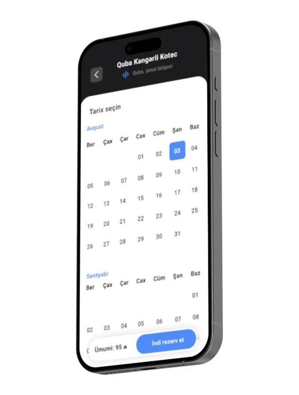
After finding out the suitable house, then customer face the reservation page that requires the exact enter and exit date details. Then the price is calculated through the selected time period.
And many more…
Insights06
Insights & Result
While creating design case for Gazgin application, I developed myself through making deep conversation and analysis with taking global brands as sample.
As a result, I have created the minimalist and easy-scroll design for this startup project. Making high-level UX design will help coders in the development process.